Wednesday, September 30, 2009

Lisa Engelbrecht Workshop

Last week I was lucky enough to be able to spend 2 days in a workshop taught by calligrapher Lisa Engelbrecht. I had a blast!

I have lettered many times on fabric over the years, but with a difference. As a kid, I grew up sewing. A lot. And the first thing I did with fabric was throw in in the washing machine to take out the sizing. Any self-respecting pen and ink will bleed on unsized fabric, so I always used gouache and a brush. Lisa does not wash her fabric first. And, well, what a difference. I was absolutely stunned at how easily and well the fabric took pen and ink and paint.

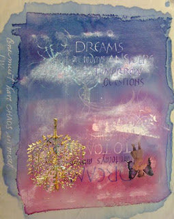
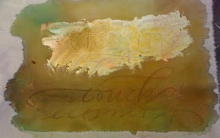
Here are some photo from the class:


At the top is a double ended piece coloured with many paints and inks. I mostly used Magic Color inks and FW - and Lumiere acrylic paint. It is decorated with an image transfer, a stencilled tree with varigated leaf. Turns out the gesso underneath made it very difficult to letter over near the top. Grrrrr. "Eternity", below, was a swath of gesso which I lettered into while the gesso was still wet, then, when dry, topped with acrylic ink. "Touch" was lettered in wet ink with Portfolio Pastels.

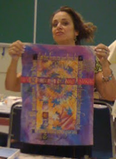
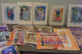
Here is Lisa (not the best photo! Sorry!) sharing one of her pieces. And more eye candy on the right as she spread out her treasure on a table for us to view. You really had to see these gems in person. Want to see more of Lisa's very very cool stuff? Check out her website! (and her blog)
Ultimately we were to assemble our smaller bits and pieces on a larger background. Here is what I had after torturing myself for quite a long time. I struggled to combine earth colours and pinks and blues. Finally, when I got home, I converted the photo to black and white to see if that helped me. Well, bottom line. I need more contrast. Maybe a block of lettering on the background. So this will join my other UFOs (un finished objects!) until I give it some more thought!
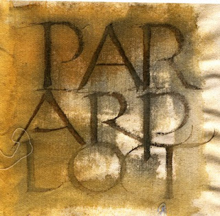
Here are a couple more items I did.... Too much fun! Thanks Lisa! And thanks to the Warmland Calligraphers for hosting her workshop!


A link to Lisa's book

Thursday, September 17, 2009

In The Sweetness of Friendship


Here is some artwork I did recently and now that it has arrived and been unwrapped, it's safe to add it to my blog!
Happy Birthday Susan!


Schmincke Gouache
Arches 140 lb Hot Press Watercolour Paper
3-1/2 Mitchell Roundhand Nib

Border:
Spellbinders Wisteria Border Grand blind embossed on
Arches 140 lb Hot Press Watercolour Paper
Spellbinders Wizard

Sunday, September 6, 2009

Vellum/Translucency Experiment

Whew! Where has the time gone!


A few weeks ago, Lois asked me about paper vellum and that led into questions about what type of vellum was good for lettering onto. Well, it was something I'd been meaning to get to and finally did!


Real vellum is calfskin. Mmmm, so yummy for lettering onto. Most know vellum as the translucent paper you find in art supply, scrapbooking and craft stores (and on my website! lol! in colours, irridescent, gold and a few others). It's also a particular surface texture in machine made papers: So beware of something like Bristol Vellum, which is thick like Bristol Board, but has a vellum surface..... Lois was looking for a paper she could see through and accepted pen and ink well.


I carry a number of thin papers which accept ink very well and you can see liners through very easily. I also carry cardmaker's/crafters vellum. Excuse the lettering. This wasn't an exercise in fine letterforms! Ahem!


Here is a painting I did years ago. (love little fat chickadees!)


And below is the painting covered with various papers which I have lettered on with various inks. We were looking for a good transluscent paper which accepted broad-edged lettering and ink well. In the process, I found a new "love"!


I used a Parallel pen with Parallel pen ink on each one, as well as
a Mitchell Nib and Higgins and
a Mitchell Nib with Magic Color ink


The first sample is on Boris #37. Takes ink well! Not so translucent.... (and that would be an understatement...)


The second sample is on Cotton Comp. It's a little more translucent. Takes ink well. Both Boris and Cotton Comp are great practice papers!


Sample 3 is on Graphics 360 - Me and Graphics 360 get along really well! It's better than the other two - it's just not so translucent for this purpose!


Sample 4 is on Grafix Vellum - *this* is the look we're after. However lettering on it is not so easy. It's very slick. The Higgins performed best on it, Parallel and Magic ink spread so the hairlines weren't as obvious. Too clunky a look for me personally.


Sample 5 is on the Sheer Trace. To my mind, this performed best. I was delighted when I put the pen down on it. It performed well with all the inks. Suzanne is a happy camper! (and calligrapher!)


Hope this helped! Happy lettering, Suzanne