Wednesday, October 28, 2009

Winnipeg Delight

I just returned from two awesome days of teaching in Winnipeg.

On Saturday we Added Funk to our Foundational. Along with reviewing Foundational, we also discussed pen nibs and how they work as well as looking at various inks and different type of nibs. I *think* we managed to get everyone straightened out so they were making their letters without fighting with their tools! Ahhhh, there is nothing quite like making beautifully crisp strokes with pen and ink!

Each participant received pieces of the following papers to test their lettering on:
Boris 37
Cotton Comp

Graphics 360
Paper for Pens
Fabriano Ingres - Celeste (Sky Gray)

In the afternoon, along with adding Funk, we added glitz. We played with
Jones Tones Plexi Glue on the Dreamweaver Tree of Life stencil , which was later foiled with Jones transfer foil.
We lettered with Schmincke Tro-Col .
We lettered with Jerry Tresser’s Gold Size and then gilded with 24K Transfer Gold and Moon Gold
We colour blended with Ecoline Inks
And we decorated letters made with Automatic Pens and Parallel Pens with Gel Extremes

My hostess , Charlotte, lettered with Jerry Tresser’s Gold Size and then applied Varigated Green composition leaf to the letters. The results were amazing! I’m going to have to try that myself! Thanks Charlotte!

We took over a wonderful art room at a lovely private school for the weekend. The lighting was very good, which made it a pleasure to work in. You really want to take a workshop with this group: Every morning at 10 am, the coffee cart arrives with coffee, tea, scones and muffins.

My hostess, Charlotte, fed me a wonderful homemade pizza using her freshly made focaccia. Yum! Subsequent lunches were made on the same focaccia. Lucky me! I was treated to fabulous Thai food and Sushi (ahem, NOT the same evening!) Thanks so much to Charlotte and her husband for the Thai treat and Charlotte and Irene for the Sushi! (Did we ever figure out which one had the eel?)

On Sunday we created the Pipe Organ binding and the group made really lovely books. It was the first time I’d used some of the papers in this kit and results were awesome.
The cord used for making the Pipe Organ Binding is found here, and the punches are here. Waxed linen thread is here. The Removable Tape is here. Another item we used was the Soapstone Pencil for marking dark paper and bookcloth.


Thank you so much to this wonderful group for making my visit so enjoyable. A special thanks to Charlotte and her family for their hospitality!

And thanks to Mother Nature for keeping the temperature above zero and saving me from packing my boots!


Happy lettering and binding everyone! Thank you so much! Suzanne

Sunday, October 4, 2009

Naughty ATC

The title got your attention, didn't it? vbg!


I made this little girl image up for students in the Lutradur class to use if they so wished and I can't resist using her everwhere!

I was cleaning up my drafting table in anticipation of a whack of certificates arriving and... well... It's getting there....

Items used to make this ATC
Notting Hill 7 Gypsies paper (part of 2 different sheets)
Flourished Corners Quietfire Rubber stamp
Flourishes Quietfire Rubber stamp
Naughty Nice Quietfire Rubber stamp
Star Brad
Distress Inks: Faded Jeans Tea Dye

Wednesday, September 30, 2009

Lisa Engelbrecht Workshop

Last week I was lucky enough to be able to spend 2 days in a workshop taught by calligrapher Lisa Engelbrecht. I had a blast!

I have lettered many times on fabric over the years, but with a difference. As a kid, I grew up sewing. A lot. And the first thing I did with fabric was throw in in the washing machine to take out the sizing. Any self-respecting pen and ink will bleed on unsized fabric, so I always used gouache and a brush. Lisa does not wash her fabric first. And, well, what a difference. I was absolutely stunned at how easily and well the fabric took pen and ink and paint.

Here are some photo from the class:


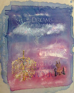
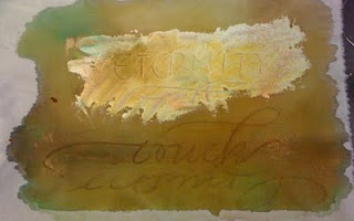
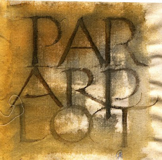
At the top is a double ended piece coloured with many paints and inks. I mostly used Magic Color inks and FW - and Lumiere acrylic paint. It is decorated with an image transfer, a stencilled tree with varigated leaf. Turns out the gesso underneath made it very difficult to letter over near the top. Grrrrr. "Eternity", below, was a swath of gesso which I lettered into while the gesso was still wet, then, when dry, topped with acrylic ink. "Touch" was lettered in wet ink with Portfolio Pastels.

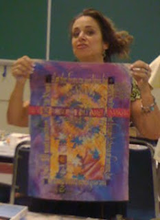
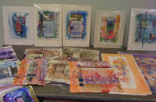
Here is Lisa (not the best photo! Sorry!) sharing one of her pieces. And more eye candy on the right as she spread out her treasure on a table for us to view. You really had to see these gems in person. Want to see more of Lisa's very very cool stuff? Check out her website! (and her blog)

Ultimately we were to assemble our smaller bits and pieces on a larger background. Here is what I had after torturing myself for quite a long time. I struggled to combine earth colours and pinks and blues. Finally, when I got home, I converted the photo to black and white to see if that helped me. Well, bottom line. I need more contrast. Maybe a block of lettering on the background. So this will join my other UFOs (un finished objects!) until I give it some more thought!

Here are a couple more items I did.... Too much fun! Thanks Lisa! And thanks to the Warmland Calligraphers for hosting her workshop!


A link to Lisa's book

Thursday, September 17, 2009

In The Sweetness of Friendship


Here is some artwork I did recently and now that it has arrived and been unwrapped, it's safe to add it to my blog!
Happy Birthday Susan!


Schmincke Gouache
Arches 140 lb Hot Press Watercolour Paper
3-1/2 Mitchell Roundhand Nib

Border:
Spellbinders Wisteria Border Grand blind embossed on
Arches 140 lb Hot Press Watercolour Paper
Spellbinders Wizard

Sunday, September 6, 2009

Vellum/Translucency Experiment

Whew! Where has the time gone!


A few weeks ago, Lois asked me about paper vellum and that led into questions about what type of vellum was good for lettering onto. Well, it was something I'd been meaning to get to and finally did!


Real vellum is calfskin. Mmmm, so yummy for lettering onto. Most know vellum as the translucent paper you find in art supply, scrapbooking and craft stores (and on my website! lol! in colours, irridescent, gold and a few others). It's also a particular surface texture in machine made papers: So beware of something like Bristol Vellum, which is thick like Bristol Board, but has a vellum surface..... Lois was looking for a paper she could see through and accepted pen and ink well.


I carry a number of thin papers which accept ink very well and you can see liners through very easily. I also carry cardmaker's/crafters vellum. Excuse the lettering. This wasn't an exercise in fine letterforms! Ahem!


Here is a painting I did years ago. (love little fat chickadees!)


And below is the painting covered with various papers which I have lettered on with various inks. We were looking for a good transluscent paper which accepted broad-edged lettering and ink well. In the process, I found a new "love"!


I used a Parallel pen with Parallel pen ink on each one, as well as
a Mitchell Nib and Higgins and
a Mitchell Nib with Magic Color ink


The first sample is on Boris #37. Takes ink well! Not so translucent.... (and that would be an understatement...)


The second sample is on Cotton Comp. It's a little more translucent. Takes ink well. Both Boris and Cotton Comp are great practice papers!


Sample 3 is on Graphics 360 - Me and Graphics 360 get along really well! It's better than the other two - it's just not so translucent for this purpose!


Sample 4 is on Grafix Vellum - *this* is the look we're after. However lettering on it is not so easy. It's very slick. The Higgins performed best on it, Parallel and Magic ink spread so the hairlines weren't as obvious. Too clunky a look for me personally.


Sample 5 is on the Sheer Trace. To my mind, this performed best. I was delighted when I put the pen down on it. It performed well with all the inks. Suzanne is a happy camper! (and calligrapher!)


Hope this helped! Happy lettering, Suzanne


Sunday, August 2, 2009

Hermann Zapf video

Thanks to a variety of people for alerting me to the existence of this video and to Johnny Dib (whoever you are!)for uploading it onto Vimeo!

I don't know how old this video is, but Hermann Zapf is a very old fellow now. A very brilliant old fellow, I might add.

This is a great video to watch, but keep in mind that it's not really a beginner video and ideas and technology have changed immensely since it was made.

What really struck me is how many times he strokes his letters to build them up. You have to know your letterforms really really well to do that! And yes, while handmade paper *can* be beautiful to work on, it's safest to go with a consistent machine-made paper for beginners.

This is a real treasure!
If you are receiving this as an email blog entry, please click on the title which will bring you to the blog to view the video.
It's almost 20 minutes long.
Happy viewing - enjoy watching a master at work!

Monday, July 20, 2009

New byhand Newsletter!


In case you've missed it!

There is a new byhand Newsletter!


There is lots to look at in this edition featuring photos of artwork by the winners of the anniversary draws, a book review, swaps from the byhandartists and details of the new online class are announced here!
and more....!
Thank you so much to those who contributed to this newsletter!
I hope you enjoy the July 2009 byhand Newsletter


please note the Firefox browser has real problems displaying the Amazon links - both books shown are available on Amazon.com and Amazon.ca - Internet Explorer and Safari show correctly.

Saturday, July 11, 2009

Video Tutorial - Filling Your Nib

The newest installment! Hope it helps!

(if you're receiving this as an email update, please click on the title and you will be redirected to this blog where you can view the video)


Products used in this tutorial:

Mitchell Roundhand Nib

Nib holders

Higgins Eternal Ink

Rinky Dink

Shortie Pipettes

Gouache - Schmincke Calligraphy Ultramarine Deep Blue

Bristle Brush

palette

Wednesday, July 1, 2009

Happy Birthday!

Happy Birthday Canada! I'm thinking you're 142 years old if I did my calculations correctly... Hope I look as good at that age!

But aside from Canada's birthday, more important in our home, it's the birthday of one of our teenagers. Here is his card:


Outside: Sweet Sixteen
Inside: Or not

Friday, June 26, 2009

Lettering/Stamping in a Circle Tutorial


This artwork was planned for the Tuesday Created byhand Challenge a few weeks ago, but, ahem, I didn't get it done in time. So it became a tutorial for my website!
You can see how it was done here!